Hospital Bill Estimator App
A UX research and usability-focused project exploring trust, accessibility, and healthcare pricing transparency.
Project Overview
Designed a hospital bill estimator app as part of the Google UX Design Certificate to improve transparency and accessibility around healthcare costs. The project focused on usability, trust, and simplifying complex medical pricing information.
Problem Statement
Many patients struggle to understand estimated healthcare costs before procedures. Existing systems can feel confusing, inaccessible, and difficult to trust. The goal was to create a clear and easy-to-use app that helps users estimate medical expenses with confidense.
Research Goals
Improve usability
Improve accessibility
Understand user trust
Simplify navigation
Make cost breakdowns understandable
Research Questions
How easily can users navigate from homepage to estimate?
Do users understand insurance and cost breakdowns?
Does the estimate feel trustworthy?
What information increases user confidence?
User Research and Methodology
To ensure the hospital bill estimator app was intuitive, accessible, and trustworthy, I conducted a usability focused research study to better understand how users interact with the prototype and interpreted healthcare pricing information.
The research aimed to identify pain points within the navigation flow, evaluate whether users understood the cost breakdowns provided, and explore how trustworthy the estimated pricing felt during the experience.
Participants
Key Findings
5 participants aged 18+ with different levels of digital literacy and healthcare experience took part in the study.
Participants were asked to complete a task: "Find the estimated cost for a medical procedure starting from homepage."
During testing, I observed:
Task completion
Navigation flow
Hesitation points
User feedback and reactions
Users needed clearer navigation and visual hierarchy
Insurance and pricing information required simpler explanations
Trust increased when cost breakdowns felt transparent and easy to read
Design Improvements
Visual hierarchy
Navigation flow
Button clarity
Readability of pricing information
Overall accessibility and usability
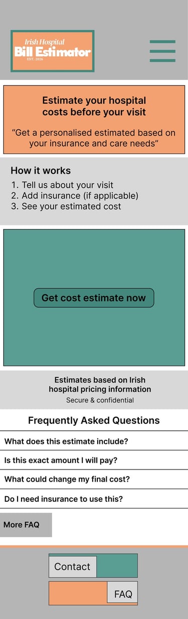
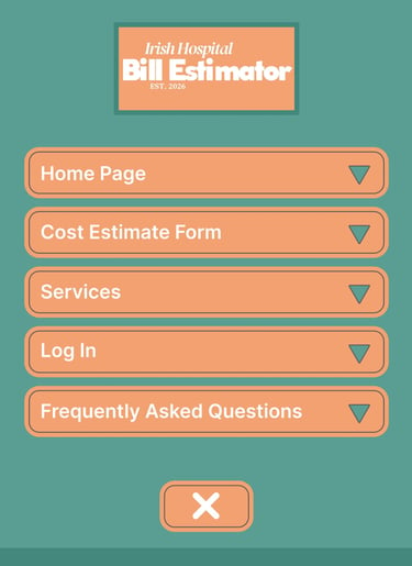
I created low-fidelity wireframes to explore the app structure, navigation flow, and presentation of healthcare pricing information
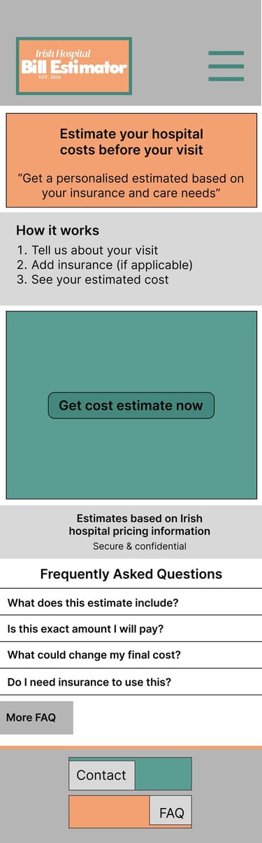
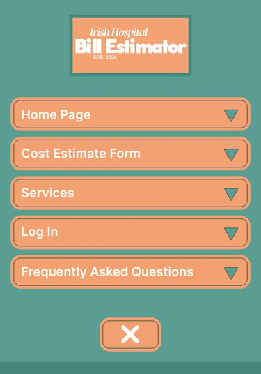
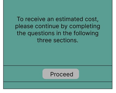
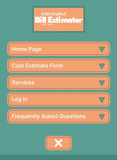
Homepage and Drop-Down Menu
Focused on simple navigation
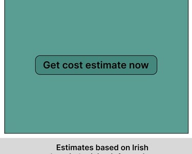
Introduced primary call-to-action
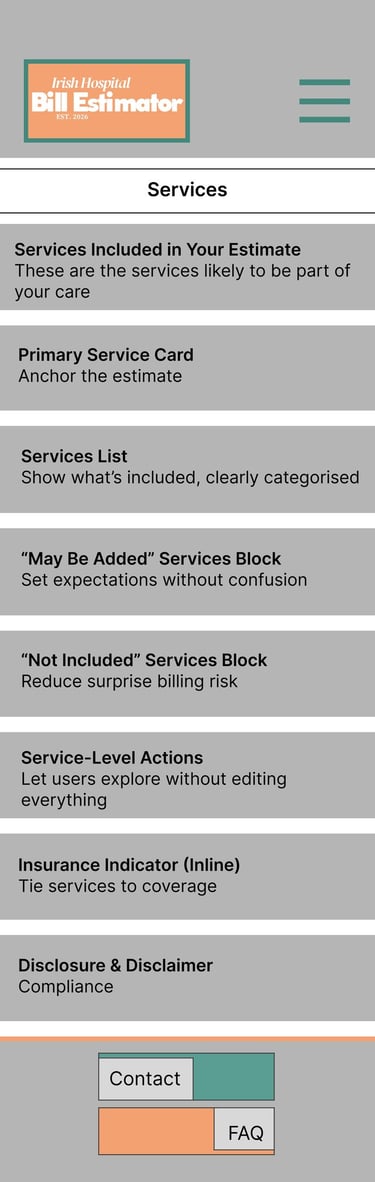
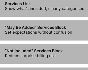
Services
Created to help users quickly browse available medical procedures and services
Organised information into clear categories for easier navigation
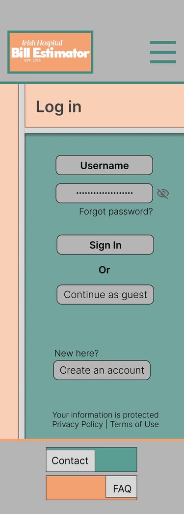
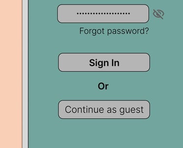
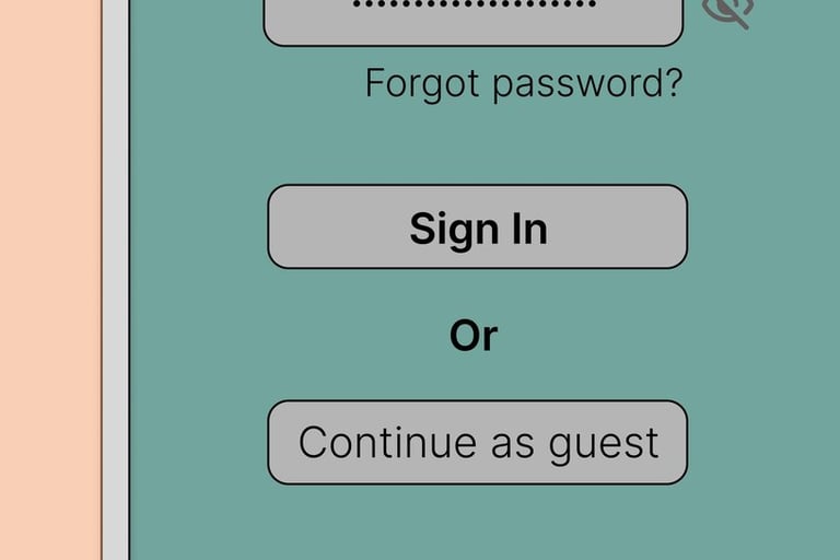
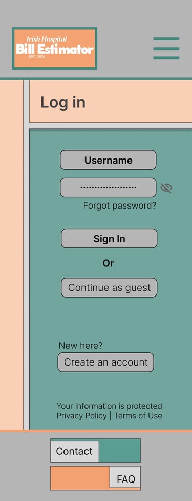
Log In
Designed to create a simple and familiar sign-in experience
Prioritised accessibility for users with varying digital literacy levels

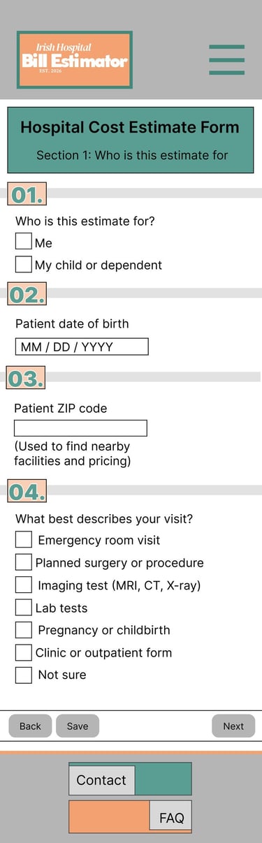
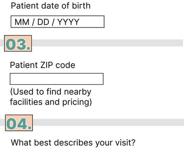
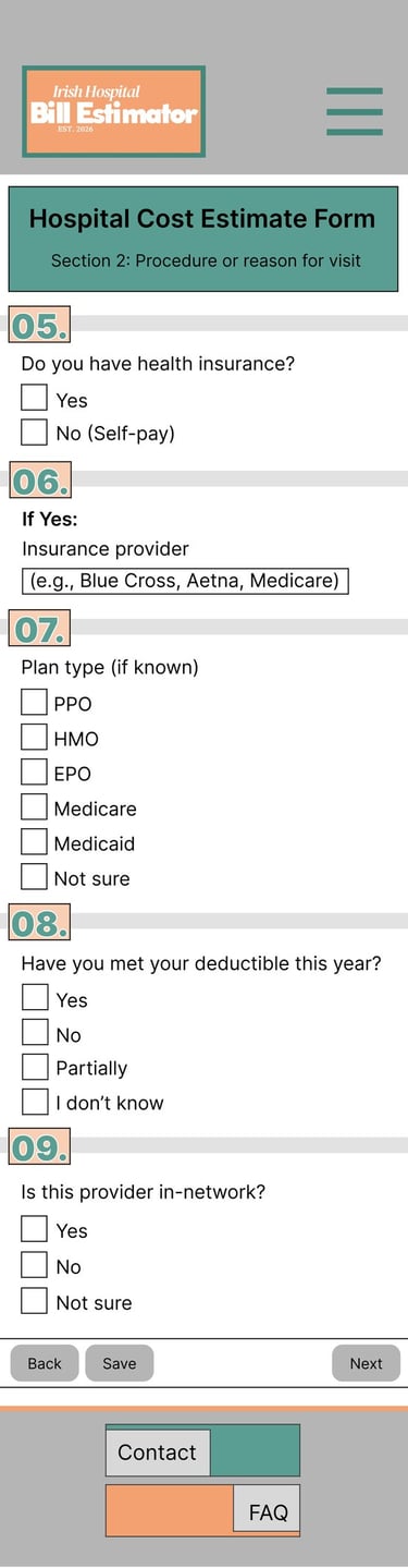
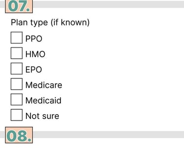
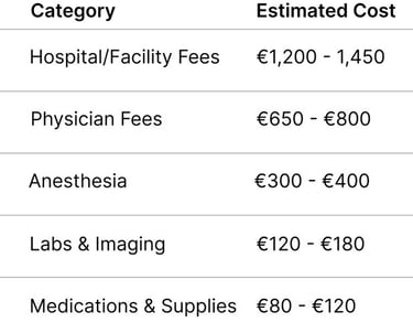
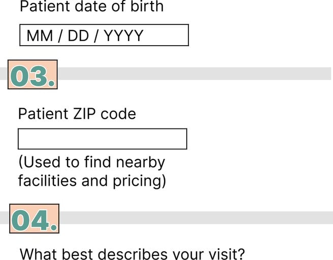
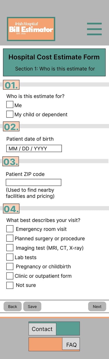
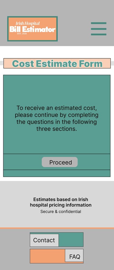
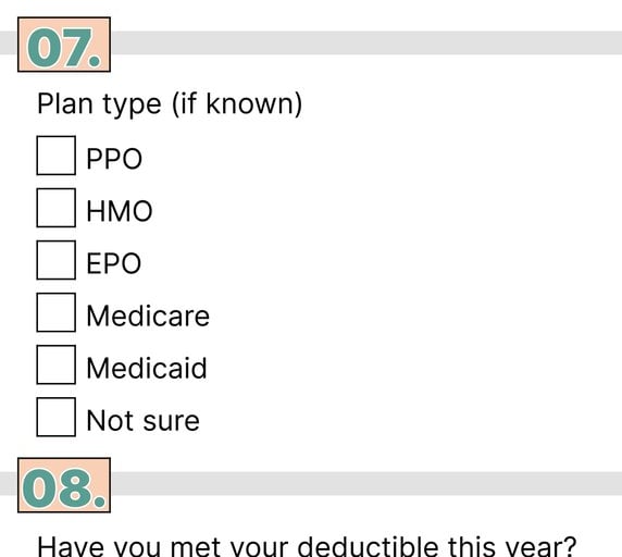
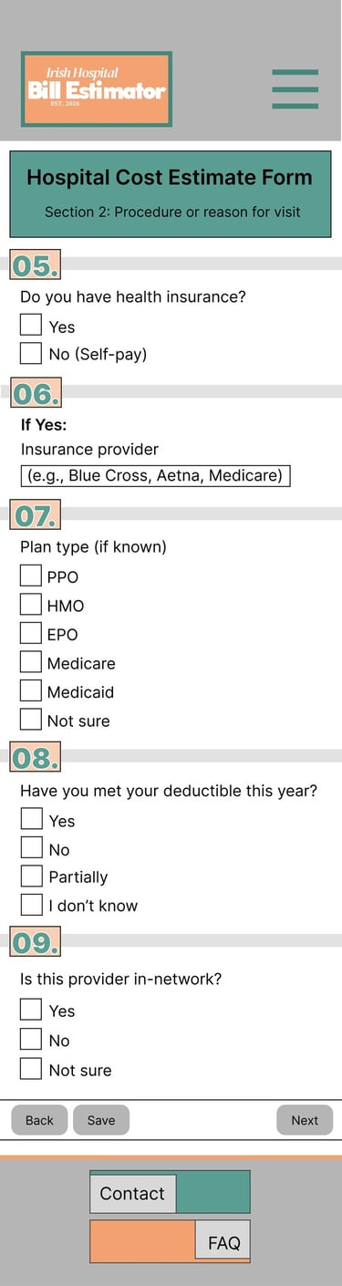
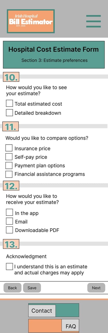
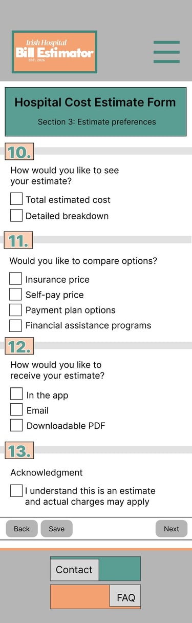
Cost Estimate Form
Designed to collect procedure and insurance information in a simple step-by-step flow
Focused on reducing confusion through clear input fields and structured layout

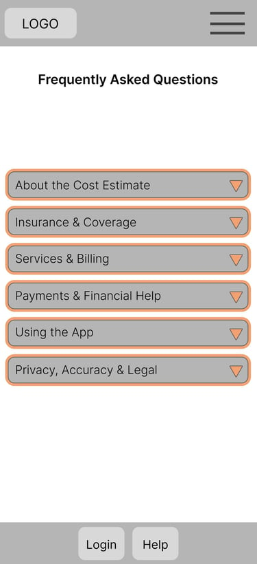
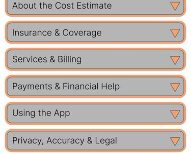
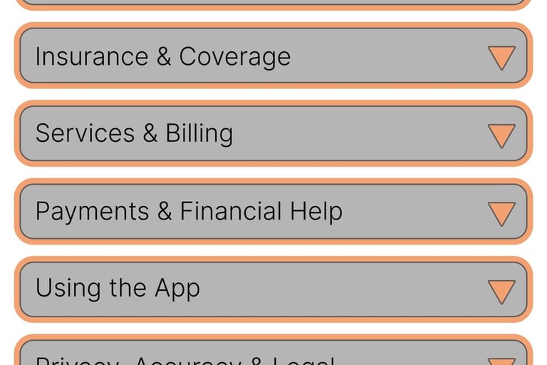
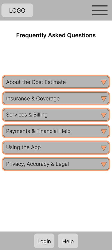
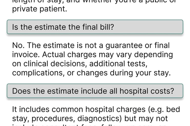
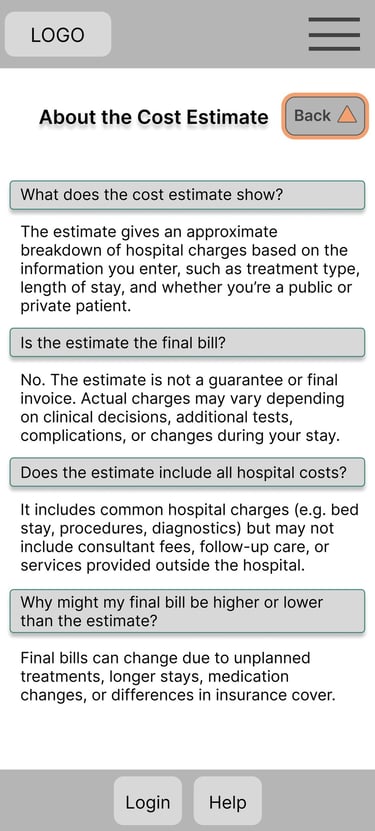
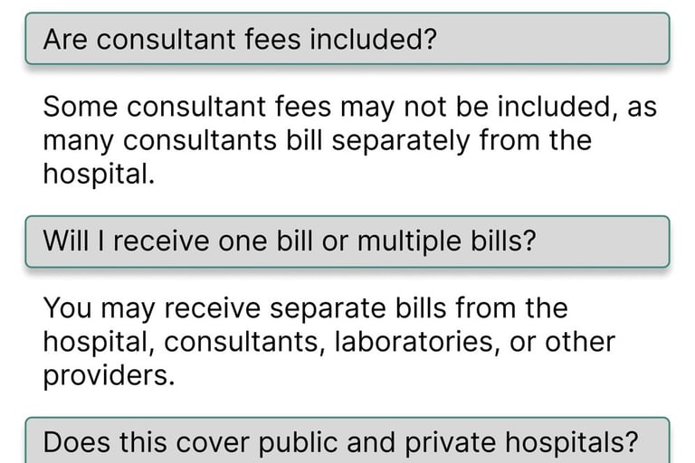
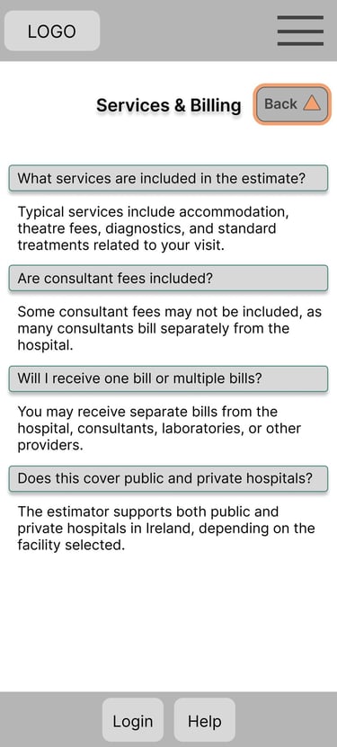
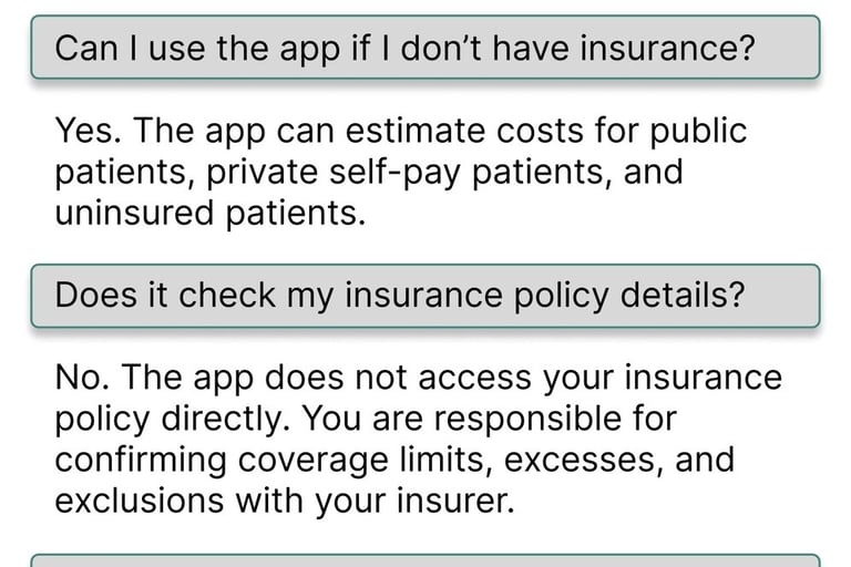
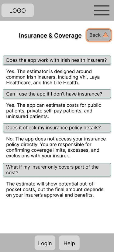
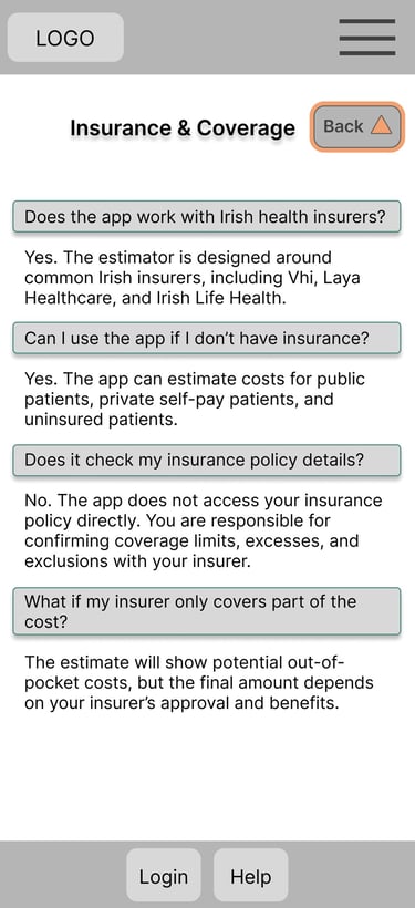
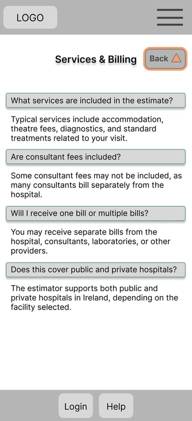
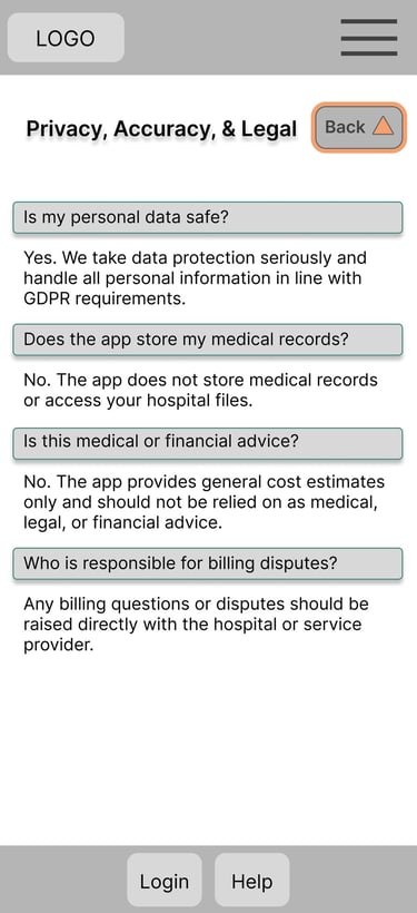
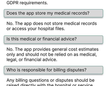
Frequently Asked Questions
Included to improve transparency and answer common concerns about pricing and estimates
Structured to help users build trust and better understand the apps purpose and limitations
Project Overview
Designed a hospital bill estimator app as part of the Google UX Design Certificate to improve transparency and accessibility around healthcare costs. The project focused on usability, trust, and simplifying complex medical pricing information.
Problem Statement
Many patients struggle to understand estimated healthcare costs before procedures. Existing systems can feel confusing, inaccessible, and difficult to trust. The goal was to create a clear and easy-to-use app that helps users estimate medical expenses with confidence.
Improve usability
Improve accessibility
Understand user trust
Simplify navigation
Make cost breakdowns understandable
Research Goals
How easily can users navigate from homepage to estimate?
Do users understand insurance and cost breakdowns?
Does the estimate feel trustworthy?
What information increases user confidence?
Research Questions
User Research & Methodology
To ensure the hospital bill estimator app was intuitive, accessible, and trustworthy, I conducted a usability focused research study to better understand how users interacted with the prototype and interpreted healthcare pricing information.
The research aimed to identify pain points within the navigation flow, evaluate whether users understood the cost breakdowns provided, and explore how trustworthy the estimated pricing felt during the experience.
5 participants aged 18+ with different levels of digital literacy and healthcare experience took part in the study.
Participants
Participants were asked to complete a task: “Find the estimated cost for a medical procedure starting from the homepage.”
During testing, I observed:
Task completion
Navigation flow
Hesitation points
User feedback and reactions
Key Findings
Users needed clearer navigation and visual hierarchy
Insurance and pricing information required simpler explanations
Trust increased when cost breakdowns felt transparent and easy to read
Design Improvements
Visual hierarchy
Navigation flow
Button clarity
Readability of pricing information
Overall accessibility and usability
I created low-fidelity wireframes to explore the app structure, navigation flow, and presentation of healthcare pricing information.
Focused on simple navigation
Introduced primary call-to-action
Homepage and Drop-down Menu

Designed to collect procedure and insurance information in a simple step-by-step flow
Focused on reducing confusion through clear input fields and structured layout
Cost Estimate Form
Created to help users quickly browse available medical procedures and services
Organised information into clear categories for easier navigation
Services

Designed to create a simple and familiar sign-in experience
Prioritised accessibility for users with varying digital literacy levels
Log In
Included to improve transparency and answer common concerns about pricing and estimates
Structured to help users build trust and better understand the app-s purpose and limitations
Frequently Asked Questions