
Website Redesign
A responsive grocery store website designed to improve accessibility, customer engagement, and communication of essential store information.
Project Overview
Designed a modern and responsive website concept for Sami Swoi, an international grocery store located in Newcastle West, Co. Limerick. The project focused on creating a simple and accessible experience that clearly communicates essential store information for both mobile and desktop users.
Role
UX/UI Designer
Tools
Figma, Wireframing, Responsive Design
Timeline
2026
Project Goals
The goal of the project was to design a clean and user-friendly website that allows customers to quickly access important information such as:
Store location
Opening hours
Contact information
Social media links
Product highlights
Careers information
The design focused on simplicity, readability, and mobile-first accessibility.
Design Requirements
Work across mobile and desktop devices
Maintain consistent branding and colour usage
Use a modern and minimal design style
Clearly communicate key information without overwhelming users
Use a red and white colour palette aligned with the brand identity
The website was required to:
Design Process
The project began with low-fidelity wireframes focused on layout structure, navigation flow, and content hierarchy.
Initial wireframes explored:
Homepage structure
Image placement
Navigation positioning
Contact and location accessibility
Information hierarchy
Following feedback, the design was refined to improve:
Visual hierarchy
Accessibility
Navigation clarity
User engagement
Mobile responsiveness
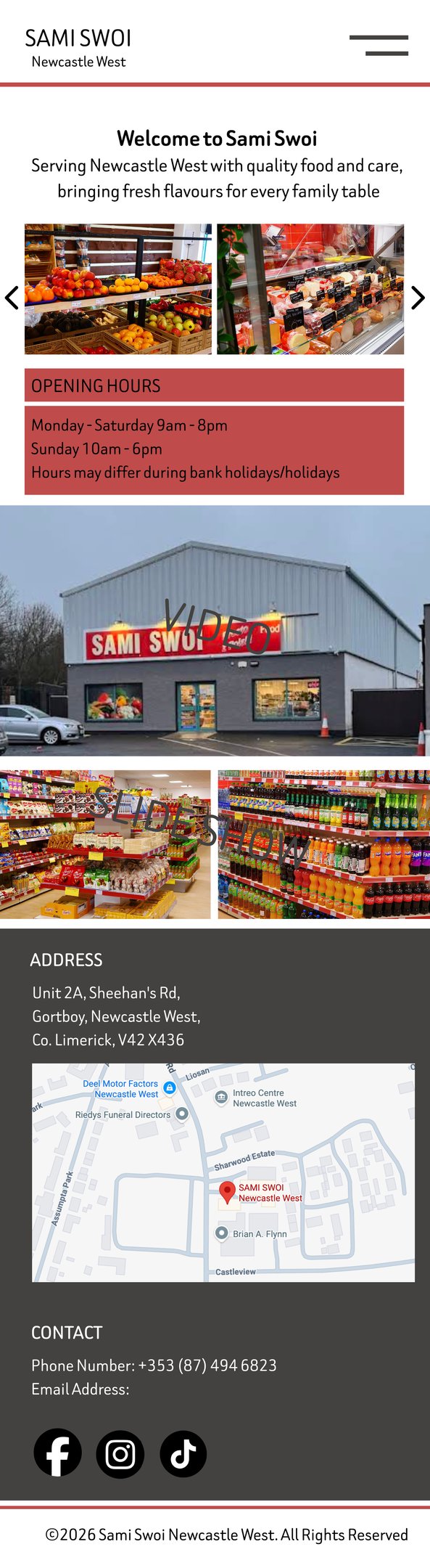
Homepage Initial Wireframe:
Initial wireframe focused on organising essential store information in a simple and accessible layout.
Homepage
Focused on presenting key information immediately upon entry
Included store imagery, opening hours, and contact details
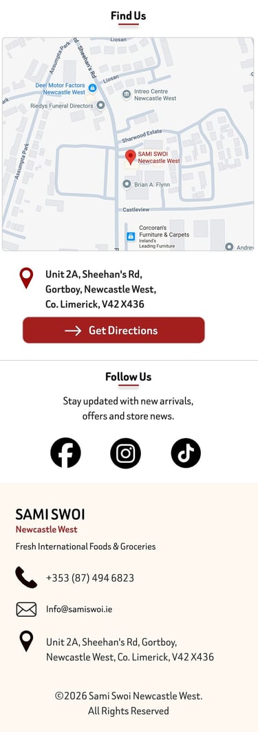
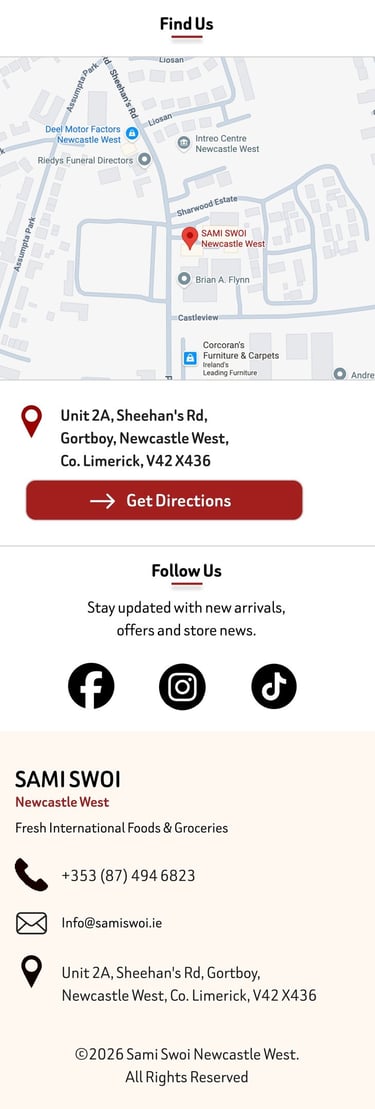
Store information
Designed to improve visibility of address and opening hours
Embedded map added to simplify navigation for customers
Social Media & Contact Created
Quick access points for customer communication
Included links to Facebook, Instagram, and TikTok
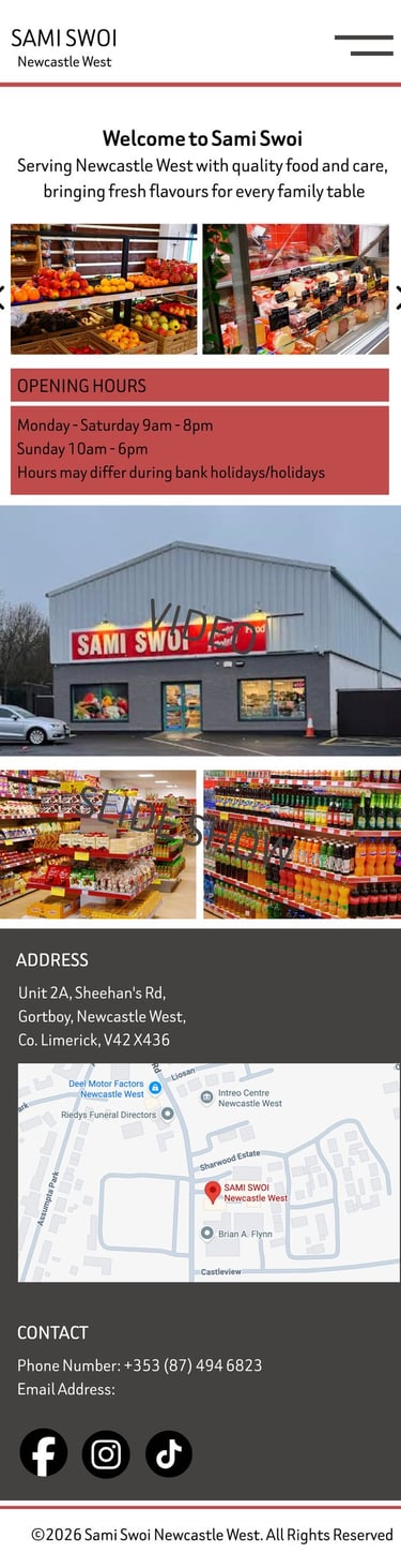
Improvements and Iteration
Based on feedback, several improvements were introduced in the updated wireframes.
Key Improvements
Stronger visual hierarchy using larger imagery and clearer spacing
Added clear call-to-action buttons such as “Call Store” and “Get Directions”
Improved mobile navigation and layout consistency
Simplified presentation of store information
Introduced product highlights to improve customer engagement
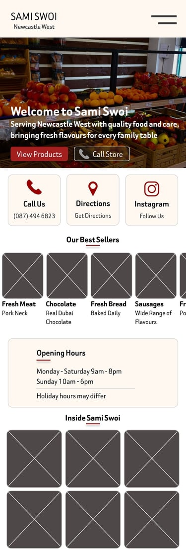
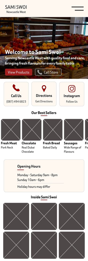
Updated Homepage Wireframe:
1.
2.
Responsive Design
The website was designed using a mobile-first approach while also adapting effectively to larger desktop screens.
Mobile Design Focus
Easy thumb-friendly navigation
Clear sections and simplified layouts
Fast access to essential information
Desktop Design Focus
Wider layout for improved content visibility
Enhanced image presentation readability
Better spacing and readability